Monday, August 27, 2012

Nate Duval


Here is a clever person indeed. Nate Duval possesses a superhuman attention span and a fairly wild creative flair, and has been commissioned to do poster art for a number of music artists including Catpower (shown here), The Decemberists and Flight of the Concords. One very interesting little fast fact is that he is married to an equally talented illustrator, Jen Skelly. Watch this space for a feature on his girl!

Sunday, August 19, 2012

Prints now available at the Boheem Shop!


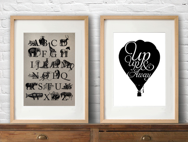
We are really excited to announce the launch of our new range of typographic prints, now available at the Boheem Shop as well as at our Etsy Store. We've framed a couple of them and have them hanging in our own homes, and they are already proving to be really popular. Some of these ideas have been bubbling away in the background in between client projects for a while now, so it's really nice that we're finally able to share them with you. We hope you like them!

Thursday, August 16, 2012

Baggu Bags


We have been fans of Baggu reusable bags for some time, but with the relatively recent introduction of their leather range (top), we are officially wholeheartedly Baggu devotees. The simple designs are delightfully elegant, and the leather is sooooo very soft. We also love the colour options... one for each season plus a couple of extras perhaps? Bottom row is the Duck (book) Bag, the Laptop Sleeve and the Daypack. Note to self for gift ideas!

Sunday, August 12, 2012

Farewell Chantel, we will miss you so very much


The studio is so quiet this morning. I'm not really sure how to start my week without seeing Chantel's cheery face and hearing all about her weekend. Friday was her last day here, after 4 1/2 years she's moving on.

What a girl, what an absolute treasure. We consider ourselves very lucky for having had her as such an integral part of the team for so long. Chantel's beautiful work is a result of a perfect combination determination, dedication and care for what she does. We will miss her so very much, and undoubtedly our clients will miss her too. 

Thank you Chantel for your sincerity, for bringing your smile every morning, for the thousands of cups of tea at 9am and 3pm, for embracing whatever craziness is going on – client fun runs, blog entries, Rizzeria printing, AGDA nights, book club, gingerbread houses… we sure have had some good times.


Monday, August 6, 2012

Brief history of Olympic pictograms


Continuing in the same Olympic theme, I thought I'd put a bit of a study together of graphic pictograms over the years. From what I could see, the icons used in Munich in 1972 were repeated in Montreal in 1976. It's really interesting that they were bold enough to use colour for Mexico City in 1968, but kept them monotone (I added tints for fun) until Sydney broke the mould in 2000. The Mexico City illustrations are also the only ones which don't depend on human forms to tell the story.

Friday, August 3, 2012

Designerlympics

Despite needing to keep my eyes popped open with matchsticks right now due to staying up far too late many school nights in a row this week watching The Olympics, I wanted to do a brief little review for us all on branding and design for this world-class event. Reason being, and I'll cut straight to the chase, is that I've been pretty thrown by the typeface they're using for the London Games this year. Love or hate it… we are not in total agreement here in the studio, but in all honesty I'm leaning toward 'hate'. Actually correction, I'm not leaning at all, I conclusively completely detest it. 

The London 2012 custom typeface is known as "2012 Headline" and was designed by Gareth Hague of Alias Foundry. I'm wondering how on earth the designers so successfully held the wool over the committe's eyes, to convince them it was a good idea to go with something so clunky, irregular and quite frankly, uncomfortable. Perhaps it may have worked as an upright typeface, especially since the 'o's are not slanted anyhow, but to me the decision to italicise something already pretty awkward just seems to make it visually choke. 

I've had a dig around the net to see what people have been saying, and my favourite was a succinct comment found on a forum which said, 'where THE F did they manage to find a font uglier and more moronic than comic sans?' Funny.

We look back over the years and although the Sydney 2000 font, ITC Binary has definitely dated, it certainly oozed personality and screamed 'important, big and exciting sporting event with serious competition'. Both Athens and Beijing settled for classic sans serif typefaces, Gill Sans and Frutiger (I think). And then we come to the font "Rio 2016", which is the font designed by the prolific and classy Dalton Maag foundry for the games in Rio (I know, surprising name eh). These guys have absolutely nailed it – this font is a great reminder of why we call type symbols 'characters' – its fluid form really personifies the richness of the city of Rio, its joyful Brazillian people and the energy of the athletes in action. Thumbs up from me.

Thursday, July 26, 2012

Biennale at Cockatoo Island


If you're looking for something fun AND cultural to do this weekend, Team Boheem highly recommend visiting Cockatoo Island to see the artworks of the Biennale. Here's Ann's report, which beautifully compliments Chantel's pictures:

"With such perfect weather last Friday Cockatoo Island and the 18th Biennale of Sydney beckoned. Add in a free ferry ride with fantastic scenery on the way and what more could you want.

In previous lives Cockatoo Island has been a dockyard, reformatory and an industrial school. It hosts many of the structures still in place which provide amazing spaces for the 50 or so Biennale artworks. Many of the artworks are site specific and on a dramatic scale.

After spending a few hours wandering around my 3 favourites were all housed in the machinery hall:

Peter Robinson's giant polystyrene chains and hewn rocks were transfixing. They presented a contraction…. items normally linked with weight and strength were light and white. It was big! and I loved the way the chains lazily draped and integrated with the metal structure existing in the building. It must have taken a team of people to put together.

Next on the favourite list was 'Domesticated Turf', a shipping container where the  artist, Cal Lane, has cut out one of the sides and ends into a filagree look arrangement. Lit up, the house look like a lantern. It even has a lawn made up of stencilled chalk patterns that form a carpet leading up to it.

Lastly, an interactive kinetic piece by Philip Beesley. As you move through it the sensors triggered by the touch of a hand causing the delicate plastic feathers, which are like flowers, to open or close. There's so much to take in... glass bottles containing liquids which look like oil hanging down and large white forms overhead that look like they are gently breathing. Very organic, like a fairyland - the garden paradise in Avatar. A really beautiful and captivating space.

Established in 1973, the Biennale of Sydney is the third oldest international art biennial. It is running through three main venues:
the Museum of Contemporary Art, the Art Gallery of NSW and Cockatoo Island, as well as at satellite sites in the inner city."

Monday, July 23, 2012

Vintage thread spools


Just thought I'll put together a little collection of vintage thread spools to share. I love the way that each of these labels is its own resolved circular design. The bygone typefaces and flourishes make me so curious. I feel sure that there will be an opportunity to reference these little beauties in a new design one day soon...

Monday, July 16, 2012

Morphos Rebrand

We always find such value in partnering with other creative teams, and our relationship with Morphos commercial office fit-out specialists has offered some great opportunities for us to explore some interior graphics ideas. Recently Morphos came to us for a rebrand, and with Chantel at the wheel, the result is an incredibly smart, clean visual identity we're very proud of.

Monday, July 9, 2012

Mulbury

Look what I found. A little online shop which sells rescued timber picture frames, industrial furniture and lots of other delightful antique (and faux antique) goodies for the home. Mulbury is based in Melbourne and whilst admittedly I do find their collection a bit hit and miss, there are definitely some really special, unique pieces I know I won't be able to live without for too much longer. 

Wednesday, July 4, 2012

Pantone Tarts by Emilie de Griottes

For all lovers of food and colour swatches, these Pantone Tarts were developed by French "food designer" Emilie de Griottes. What a quirky, tasty idea, and a nice reminder that some of the best colour inspiration can be found in the fridge!

Wednesday, June 27, 2012

Mary Kate McDevitt


Every so often, I find myself dreaming about another life to be had. In this life, I live in a pretty but humble little house with a sunny verandah where I sit each morning to drink gentle herbal tea, and eat fresh figs and rustic sourdough from the local bakery. In this dream, I don't of course have to worry about meeting client deadlines or changing a logo twenty times before it's approved. I have all the time in the world, so I choose to spend it tinkering away with my paints, inks and pencils creating mind-blowing hand-drawn typography pieces, day after day. 

Unfortunately, I think I'm still at least a few years off fulfilling that dream. Until then, I'll swoon over clever and charming unique typographic studies created by people like Mary Kate McDevitt. Who probably lives in an urban apartment like me and simply makes making beautiful things like this a priority amidst the daily grind.

Wednesday, June 20, 2012

The Art For Jungle Project

Just letting ya'll know about a little art show which is on for one night only next Thursday 28th June, 6pm at the Lo-Fi Bar, 383 Bourke Street (above Kinselas on Taylor Square), Darlinghurst. It's called The Art For Jungle Project, and it's an eclectic collection of art, design and jewellery with contributions from artists across Australia. The purpose of the exhibition is to raise funds for Greenpeace, so they're collecting $5 donations at the door. I've handed over a couple of my etchings as well as two of Boheem's not-yet-launched typographic screen prints. Hope to see you there!

Friday, June 15, 2012

The Cake Pop-up Bar, Fraser Studios


Just one more 'places' entry before I return faithfully to all things design. I went to an opening a couple of weeks back at the Fraser Studios, and the atmosphere was positively buzzing. The space is only open for another few weeks and apparently as a last hurrah, they're serving wine, beer and cider as well as a few tasty morsels from Bourke St Bakery at The Cake pop-up bar Thurs (5-10pm) – Sun (3-10pm) each week until the end of June. It's right near the Clare Hotel off Broadway.

Tuesday, June 12, 2012

Color Collections


Designers, have you ever found yourself moving the CMYK dials mindlessly back and fourth, hoping to land the perfect colour harmony for your next design project, but feel they just don't want to land as naturally and as beautifully as you'd like? I found myself in that situation recently, and soon after came across these wonderful and very helpful colour blogs, which I'm certain will prove to be extremely useful for future design projects.

At the top we have Design Seeds, which displays palettes inspired by God Himself, and the amazing combination of hues which can be found in winter vegetables, moments of stillness in the African countryside... and some human-made beauty. What I love most about this site is that you can search for the colour by hue which you can define as a RGB value, as well as browse by theme.

In the middle we have Color Collective, which is one person's collection of palettes derived from mostly fashion shoots, where someone else has obviously already curated the colour. It is handy having it all in one place, though, and I like the way that the mood is set by the colour combinations.

Lastly there's Just Jaime – not offering as many and without links to photography, but a lovely little collection nonetheless.