
 Gotta love some extreme depth of field, and photographs taken with a macro lens. Here's one shot by Aaron Anderson – and it's not any of the fancy tilt-shift stuff making something look miniature when it's not (or the Photoshop cheat's method of doing the same thing)... this is the real deal.
Wednesday, March 30, 2011
A mini MINI
Gotta love some extreme depth of field, and photographs taken with a macro lens. Here's one shot by Aaron Anderson – and it's not any of the fancy tilt-shift stuff making something look miniature when it's not (or the Photoshop cheat's method of doing the same thing)... this is the real deal.
Monday, March 28, 2011
Craft's not dead


 Canadian-born Brooklyn illustrator and artist Jillian Tamaki has just finished this adorable suite of book cover designs for three of my favourite Penguin Classics. Long live craft.
Wednesday, March 23, 2011
Tin Tiles


Back in the 90's we had the 'feature wall' – it was when just one wall in your home got to be a different and much more interesting colour than the other walls. Then we had a wallpaper revival – and golly there have been some beautiful pattern designs emerge over the last few years as a result of that. We've also seen timber panelling make a pretty solid comeback. I don't know, but I think there's a place in our homes, bars and retail spaces for some of the good ol' aluminium ceiling and wall panelling. It's shown here in its raw metallic form, but it looks really great when painted, too.
Monday, March 21, 2011
Sweets Workshop Summer Hill


You know, I do love living in Sydney's Inner West. Besides the outstanding handmade noodles in Ashfield and the quirky, gritty, character-filled pubs in Newtown... every so often there's a store which opens in an unlikely place selling interesting, beautiful and unlikely things. The Sweets Workshop opened in July last year and holds an indeed sweet collection of homewares and artworks, made by desingers Australia wide. Featured illustrators, jewellers and crafters include Emma Jane, Allira Tee, Genna Campton, Anna Nakalevu and Zoe Churchill.
Wednesday, March 16, 2011
A Heritage in Typesetting

For some people, it's the happy tune of Green Sleeves as the ice cream truck comes hurtling down the street which reminds them of their childhood. For others, it's roller skating up and down the driveway for hours on end in the afternoon, and refusing to remove said skates at dinnertime. For me, it's the smell of fresh ink, climbing on dusty piles of paper in storage rooms, and the loud CLUNK - CLUNK of the letterpress machines which takes me back to the good ol' days.
I don't know about the whole nature/ nurture debate, but I believe I was quite possibly destined to be a graphic designer. It's in my blood. Back in the days before 'graphic design' was even a career option (and one could change a font with the quick click of a button), my grandfather, Alf Pausey, was a typesetter and printer. He ran his own print business, and donned his blue overalls every day to head to "Poppa's work", where he'd carefully set letter by letter, line by line using copper and zinc printer's blocks. I remember his hands were always covered in ink. When the pages needed to be collated, it was done by hand in the back room – overseen by Margaret (who always had an Arnott's biscuit for me).
When Poppa wanted a new typeface, it wasn't quite as simple as downloading what he wanted from myfonts or dafont. He had to invest in a few new timber drawers full of letters – in all the different point sizes he thought he'd use. And I get the feeling that when a client made a change, it was never as simple as opening an Indesign file and re-typing.
Thanks, Poppa – for the precious heritage you've passed on to me.
Thursday, March 10, 2011
Moody Bored

The iced coffee packaging we designed last year for One Tree Coffee Co was featured a few days back on Lovely Package. Since then the vintage-styled branding has spread like wildfire: it's been blogged, reblogged, tagged, reviewed, liked, saved, commented on, ffffound, hearted, tweeted and tumblr'd. We're also due to appear this week in the UK Lifestyle News Network.
Since everyone has shown a little interest I thought I'd share for your viewing pleasure the mood board we built when first establishing the colour palette, styling and general feel for the espresso bar. The completed design work can be seen in our portfolio online.
Tuesday, March 8, 2011
SketchType
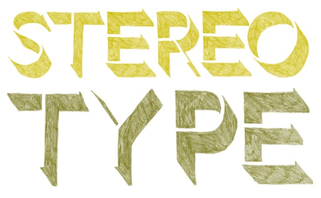
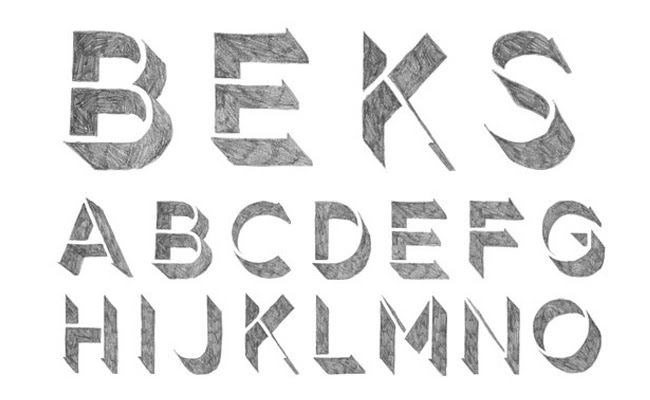
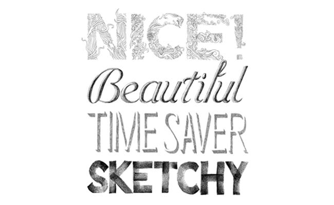
Who needs the smell of fresh pencil shavings, the sound of lead as it scratches out your uniquely handcrafted words and the feel of textured, cold paper at your fingertips? Now with Sketchtype, you can quickly and easily recreate the beautiful and hand-drawn... without the beautiful part of the hand-drawing... With each letter being cut out and placed on a transparent background, we are all now able to hand set and compose artwork in half the time. A bit of a sell-out, I know...
Take a closer look here. You'll be hooked.
Back to the Future


Irina Werning has turned her obsession for vintage photographs into an amazing series of portraits. By getting her friends and family to re-enact childhood photographs, with immense attention to detail, we are left with a series of incredible and hilarious images.
"I love old photos. I admit being a nosey photographer. As soon as I step into someone else’s house, I start sniffing for them. Most of us are fascinated by their retro look but to me, it’s imagining how people would feel and look like if they were to reenact them today"
Check out the entire set of portraits here.
Thursday, March 3, 2011
Meet my lover, Colour

Sometimes a striking colour palette is the difference between mediocre and brilliant design. And with a gazillion specks in that rainbow gamut to select from, it can be an overwhelming experience to choose the right combination. That's why colourlovers.com is our go-to for all things colour. You'll find over 1 million palettes created by other colour lovers to inspire your creative projects.
These palettes pay hommage to my favourite colour of the month... mint.
Subscribe to:
Posts (Atom)