Aranjuez is the latest font by Koziupa and Paul. It more or less combines all of the recent trends in typography design, with a celebration of the resurgence of thick/thin forms together with some fancy ornamental calligraphic swirls. It's the perfect go-to for anything which requires a bit of modern day class. This typeface is loaded with personality; it doesn't take itself too seriously and yet offers the structure and neatness which is so important for legibility.
Showing posts with label TYPEFACE FINDS. Show all posts
Showing posts with label TYPEFACE FINDS. Show all posts
Sunday, September 2, 2012
Monday, May 21, 2012
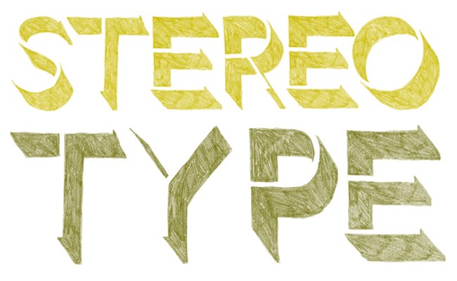
The Organic Type
Created by graphic designers for graphic designers, The Organic Type makes it easy to incorporate the texture of handcrafted lettering into any project without ever picking up a pencil. Amazing! Worth noting that these typefaces don't actually work as fonts, they have to be placed as Photoshpo file – this is due to the extraordinary detail in each letter. What a find! Now I just need a project to use it for...
Labels:
TYPEFACE FINDS
Monday, May 2, 2011
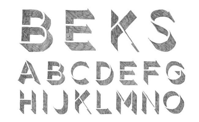
Ink Alphabet
 Giuseppe Salerno is an Italian Graphic Designer whose beautiful hand-made letters and numbers have me smiling. They're drawn with chinese ink on smooth paper, and each character has been made with confidence and care. You can buy and download both collections on the Behance Network.
Labels:
TYPEFACE FINDS
Tuesday, March 8, 2011
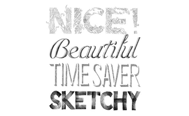
SketchType


Who needs the smell of fresh pencil shavings, the sound of lead as it scratches out your uniquely handcrafted words and the feel of textured, cold paper at your fingertips? Now with Sketchtype, you can quickly and easily recreate the beautiful and hand-drawn... without the beautiful part of the hand-drawing... With each letter being cut out and placed on a transparent background, we are all now able to hand set and compose artwork in half the time. A bit of a sell-out, I know...
Take a closer look here. You'll be hooked.
Labels:
TYPEFACE FINDS
Monday, February 28, 2011
Meet Verner


Verner is such a delightful typeface find, we just couldn't keep it to ourselves. With a set of automatic ligatures, swash characters and a selection of ornaments, what's not to love about Verner. Try or buy it at myfonts.com.
Labels:
TYPEFACE FINDS
Sunday, February 13, 2011
Happy Valentines Day!

A rather lovely illustration to brighten up an otherwise grey Valentines Day. Love from the Team at Boheem!
Labels:
BEAUTIFUL THINGS,
TYPEFACE FINDS
Monday, November 29, 2010
Mmmmmmm!
 My mum is sending cards out to her friends soon for her birthday, and she asked me to design it for her. Her name's Marianne, and I designed a M-mmmmmonogram for her. Here are a few of the other decorative M's I found along the way.
Labels:
TYPEFACE FINDS
Thursday, November 18, 2010
House Industries
 Charming plywood prints featuring retro typefaces and using an unlikely colour palette available from House Industries. This online store is the perfect place to find that special something for the graphic designer in your life!
Labels:
SHOPPING (WITH SHIPPING),
TYPEFACE FINDS
Friday, November 5, 2010
The best things in life are free
 I'm the sort of person who'll keep the discount DVD hire voucher on the back of my Franklins docket, just to save a couple of bucks on a Friday night in. So you can imagine my glee after finding this lovely, free typeface called Matilde by Typedepot. Download it here.
Labels:
TYPEFACE FINDS
Monday, October 25, 2010
Lady Rene Typeface
 Here's a lovely new font designed by Laura Varsky and Alejandro Paul which you can find at Myfonts.com. As part of the promo there's a darling pdf booklet you can download. It's a story about a black cat, which is perfect for Halloween.
Labels:
TYPEFACE FINDS
Monday, September 20, 2010
Speedball Textbook


href="https://blogger.googleusercontent.com/img/b/R29vZ2xl/AVvXsEhrFBl9wKUxMpqu-70e5-Aj1L1KIRiDVkIEADJXGEftJnj7ht1ATMfp8Z1GxGuvSmP9HgQ9SrvQxcSlqyUrjAm9OOBUL-6Jz4OsEaIXJWf1pWNjWK8_ZICiNYOj1wJWpmmMso1bczizOJI/s1600/Speedball5.jpg">

These books bring me back. My dad used to do a little sign writing on the side, he was the community favourite for all school, church and fete lettering. It was a bit of a hobby for him, and he used to have a little collection of typography books like this one. While my sisters were indulging in Enid Blyton and Elyne Mitchell, I was pouring through the beautiful pages of the Speedball Textbook, wondering just which ampersand I liked the most.
Labels:
TYPEFACE FINDS
Thursday, July 22, 2010
On the ball


I have developed an interest recently in fonts with 'ball terminals', having used script font 'Bellevue' recently in some body cream packaging for One Seed organic fragrances. It led me to the discovery of Jessica Hische's font, 'Buttermilk' – a bold and feminine script typeface which can be purchased from myfonts.com.
I've seen a couple of reviews out there about font designer Jessica Hische, where people seem to have found themselves in an expected state of delighted euphoria, having explored this particular young woman's portfolio. Her work is inspiring in every way: it makes me want to own it, see more, be better and somehow one day make her my best friend. She produces a constantly rich and quirky stream of new ideas – daily, in fact, at her blog (dailydropcap.com) where she offers the world a new drop cap every day to enjoy.
Jessica's portfolio is online at jessicahische.com.
Labels:
CLEVER PEOPLE,
TYPEFACE FINDS
Subscribe to:
Posts (Atom)


