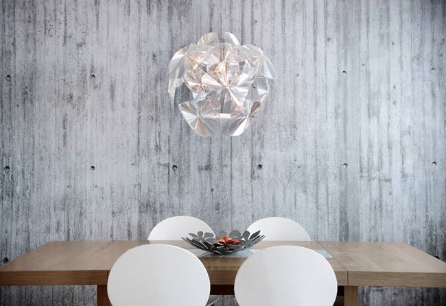

 This Norwegian interior wallpapers company has taken the idea of woodgrain-vinyl-laminate to a whole new level. These prints are exceptionally realistic-looking, and are claimed to have no pattern repeats. Love it! www.concretewall.no


 This Norwegian interior wallpapers company has taken the idea of woodgrain-vinyl-laminate to a whole new level. These prints are exceptionally realistic-looking, and are claimed to have no pattern repeats. Love it! www.concretewall.no


I have that feeling again. That feeling of pure admiration for a beautiful piece of work combined with that faint tinkle of envy for not having thought of it myself. This campaign was created by DDB in China to encourage more walking, less driving -a message cleverly conveyed in this beautiful, creative, interactive artwork. If you can't tell by looking at the photos, those green leaves are actually the footprints of pedestrians crossing the street. Genius right? For more info, or to watch the video, have a look at this link.


Perhaps it is all this sunshine, summer vibes, and the fact we now have an inflatable paddling pool in our back garden - but at the moment I am loving anything bright, colourful and fun! Beci Orpin, a Melbourne based designer/illustrator and creator of many of wonderful things recently caught my eye. Beci's projects and clients are diverse yet she manages to always stay true her unique, colourful, bold collage style. www.beciorpin.com.


 This simple, quirky site made me smile a few days ago when I found it, I had to share it with you. Are you a Comic Sans Criminal? Head to www.comicsanscriminal.com.au to find out! I'd like to see a site for the Apostrophe Criminal after this...


 Portland, Oregon. Home of good coffee, squirrels and rose gardens. Also home to the Ace Hotel, described as ‘a little modern, and a little bohemian’ - it’s no wonder why we’ve fallen in love with it’s charming styling and vintage touches. The boutique hotel chain was designed by Mathew Foster, Fritz Mesenbrink and Jeremy Pelley; a trio of Portland based designers with a penchant for clever, modern branding.