Thursday, November 1, 2012
God's Fingerprints
Found these interesting little graphic studies recently featuring various bible verses. They're from godsfingerprints.net, but the best place to see them all is on the associated Tumblr site. I think it's a collaboration, and although they rely fairly heavily on current typography trends and image treatments, I still like them. It's really just nice seeing these verses represented in such beautiful visual context. Think we can quite possibly find some inspiration there for the work we do for Scripture Union, a handful of Baptist organisations and UnitingWorld.
Labels:
BEAUTIFUL THINGS
Monday, October 22, 2012
Font Design Master Class
Which is why I'm pretty excited about the upcoming Masterclass being run by DIA – the last of three workshop days in the series. It's an all day event at the Australian Museum 17.11.12 (soon!). The lineup includes Dr Louise McWhinne from UTS plus type designers Wendy Ellerton and Dan Milne. Cost is $200 for DIA members or $250 for non, and they're saying that participants have 3 years' experience in the industry. If you're interested, drop a line to my dear friend Jacqueline Hill: jack@designasaw.com to let her know. Be quick, places are limited.
Labels:
NEWS
Wednesday, October 17, 2012
Naomi Fenton, photographer
Whilst looking for the perfect imagery to use in the upcoming issue of Global Interaction's Resonate Magazine, I came upon Naomi Fenton, a photographer with an eye for all things nostalgic and cosy. Jam jars, granny blankets, cups of tea and sweet collectables – must be an aesthetic which comes with being Tasmanian. I'm really excited about featuring a couple of shots from Naomi's 'Small Town' series in Resonate – pictures like these can really make a feature article... a feature. Thanks Naomi! Check out Naomi's blog here, where there are links to Pinterest, Instagram and other goodies.
Labels:
CLEVER PEOPLE
Friday, October 12, 2012
How to get a design job (with us)
I was recently invited by Nicky Hardcastle, lecturer in Visual Communication at UTS to share some thoughts about what I look for in a design portfolio. Thought I'd put it out there for the wider world web to benefit from.
Incidentally, we will be looking to secure a new designer for our team in the early months of 2013. If you think you can see yourself as the next Boheemian, please go ahead and send me an email.
Obviously, these tips are from my perspective and relate to design positions at our studio… hopefully they are useful for anyone wanting to secure a job in the design industry, generally speaking!
What advice would you offer to a designer when creating their portfolio? Or when presenting it? (top 3 dos and donts?)
DO
1. Kill your babies. That is, know how to edit your portfolio in a way that shows your best 10 (or so) projects. Go for a succinct, punchy portfolio which really shows your strengths.
2. A spellcheck. And for goodness sake, learn how to spell stationery.
3. Set your PDF to 'open to fit screen'.
4. Flatter us. I can almost guarantee you'll get your foot in the door if you tell me you're a fan of Boheem's and that you know and love the work in our portfolio. Just sayin.
5. In your interview, think of 4-5 key things about yourself you want to communicate in the twenty minutes you're given. They might be: 'I did work experience here', 'I won this award', 'I completed a Wordpress course', 'I run a blog with 5000 followers'. Weave these points into the conversation, don't assume we've seen that stuff in your application. And then ensure to ask at least one or two questions about us.
6. Be flexible and generous. This one is a little controversial, so do with it what you will: if you offer to work for free for us for a few days so that we can get a feel for your strengths, if we are in need of support in the studio we are likely to consider getting you in (or having you work on something for a couple of hours at home). Once you're in, you're already a step or two ahead of the other candidates. Of course, we'd never officially suggest this, but if you show flexibility and preparedness to give some, we'll relax a little and give some back.
7. Keep your email short – 2 paragraphs is fine.
8. Ensure that the images in your portfolio are clear and crisp – lo-res, pixelated images aren't a good look.
DON'T
1. Send anything over 5MB.
2. Send more than 2 PDFs (one portfolio, one CV/ letter).
3. Send any file type other than PDF – if you send me a Word Doc I will delete your email without hesitation.
4. Include anything offensive.
5. Show print marks on your files, seems obvious but I have actually seen that a lot.
6. Ask about salary in the first interview.
What do you look for in a designer’s portfolio?
Neatness. A clean portfolio which is easy to read and displays projects in a way that makes it clear what they are about shows me that this designer knows how to effectively visually communicate.
Personality. We're not accountants. Design, whilst at most times very hard work, is an exciting industry in which people dress in jeans and Tshirts, enjoy brainstorming campaign ideas in the sunshine over coffee and head out to local art openings of an evening. If you like baking on the weekend and are easily distracted by polka dots, throw this in. It's an insight to who you are.
Intuition. We're keen to work with people who can think conceptually and come up with creative and smart ideas.
A good match. You might be Australia's next big name in design, but unless I'm convinced that you're the right fit for the studio and for the type of work we do, I won't consider offering a position. We're a small studio and it's important we're all happy working together. If you're not successful in an interview it may have nothing to do with whether or not you were able to 'wow' us; it's got everything to do with us building a team of like-minded creative people. Some designers we meet with amazing portfolios are better suited at other studios with a different focus, we're ok with that and hope that our candidates can understand that too.
What kind of projects should be included in, or excluded from, the portfolio?
Include: A range of projects to show your skill set: some logo design and brand development, some newsletter layout, some digital / online work.
Exclude: Let go of the pages upon pages of illustration, photography and retouching – that's not what's going to get you a design job.
What would you say are the most common mistakes in portfolios and presentations?
1. Not addressing the email to the recipient, ie not using their name
2. Not adhering to the specifics in the request for applications in the advertisement (if there's been an ad). Read the ad carefully and if it says to use 'Mid Weight Designer' as the subject, do that.
3. Messy files with awkward typography
4. Spelling and grammar mistakes.
All the best to the jobseekers out there!
Labels:
THOUGHTS
Sunday, October 7, 2012
Odette Williams
Now here's a little online store to keep in mind next time you're on the search for unique and special gifts for kids. Odette Williams is a dear friend of Boheem's and seems to make beautiful anything she chooses to turn her hand to. She's created a lovely range of baby's and kids onesies and tshirts and is offering these at her shop, as well as some really sweet lovingly made collages, plus fun apron sets.
Although she will always call Australia home, Odette lives and works in New York. We're so excited to see her launch this range and can't wait to see what else might be added to the collection in the coming months and years.
Labels:
CLEVER PEOPLE,
SHOPPING (WITH SHIPPING)
Thursday, September 27, 2012
Shoes of Prey
In the olden days, people... the well to do at least... used to go to a tailor for their clothes, a milliner for their head attire and when after a pair of shoes, the town bootmaker was the man (sorry, girls) for the job. Footwear was lovingly and painstakingly hand made, and repaired by the local cobbler season after season to gain the absolute maximum lifespan. These days, we have a boundless array of foot fashion to choose from... but we've not yet had the pleasure of specifying EXACTLY what material, colour, finish and heel height we're wanting, until now. Enter Shoes of Prey.
Actually, it is a similar concept to what Converse and a couple of other sporting shoes companies have offered for a while. But the key difference is these are fancy, dressy shoes for us girls. Choose from soft leather, patent leather, glitter, snake skin, fish skin, cotton, silk or lace. Choose the style, the fit, the laces, the heel height, go completely Priscilla-esque or Nanna-style... and create a pair of shoes which is uniquely you.
Labels:
SHOPPING (WITH SHIPPING)
Thursday, September 20, 2012
Put the Spray Away
Lauren De Lange from AFNSW shared some of the feedback with us in a recent email:
"I just wanted to touch base with you to inform you that we have received an incredible response to our schools aerosols and asthma campaign. Below is some feedback from teachers:
'Thank you very much for sending through the “put the spray away so we can all breathe a little easier” posters! What a great idea, we have placed the posters in both our change rooms. Being an all girls school we are constantly reminding the girls to not spray - the great thing about the posters is that they give the reason why students shouldn’t spray the deodorants/body spray/hair sprays in a very easy to read appealing manner.'
I just wanted to say thanks for much for all the efforts you and your staff made in developing the posters for us; they have really hit the mark with this group and have appealed to both teachers and students."
Thanks to Siobhan from The Writers' Group who helped out with the copywriting for this project as well. It was a wonderfully successful team effort!
Labels:
NEWS
Monday, September 17, 2012
Tiempo Packaging shortlisted for Desktop Create Awards
Creatives, if you haven't picked up a Desktop magazine lately I recommend you do so. Australia's favourite (only?) graphic design publication of its kind has recently undergone a facelift and I for one really enjoy having a flick through its uncoated pages filled with relevant, interesting and well organised content when our copy arrives each month. If you're not near a newsagent this minute, check out their website which is a great source for info on trends, events, tips and other handy designy stuff.
Seems too that some of the big names in Australian graphic design are sitting up and taking notice, and this year the level of competition for the Create Awards seems to have reached new heights. I'm so proud to see that Boheem are still in there; this year we have been shortlisted for the packaging we designed for Tiempo Coffee by Scottie Callaghan.
Labels:
NEWS
Wednesday, September 12, 2012
Inaluxe Prints
Aren't these prints just lovely? They are by Inaluxe, a little design studio in country Victoria owned and run by Kristina Sostarko and Jason Odd. I absolutely love the attention to detail which has been applied to these wonderfully organic, slightly retro prints. The colour palettes are just beautifully resolved. These guys offer a wide range all designed in the same style as both small and large prints. Their online Cartel store makes it all too easy to make one of them yours.
Labels:
SHOPPING (WITH SHIPPING)
Sunday, September 2, 2012
Aranjuez
Aranjuez is the latest font by Koziupa and Paul. It more or less combines all of the recent trends in typography design, with a celebration of the resurgence of thick/thin forms together with some fancy ornamental calligraphic swirls. It's the perfect go-to for anything which requires a bit of modern day class. This typeface is loaded with personality; it doesn't take itself too seriously and yet offers the structure and neatness which is so important for legibility.
Labels:
TYPEFACE FINDS
Monday, August 27, 2012
Nate Duval
Here is a clever person indeed. Nate Duval possesses a superhuman attention span and a fairly wild creative flair, and has been commissioned to do poster art for a number of music artists including Catpower (shown here), The Decemberists and Flight of the Concords. One very interesting little fast fact is that he is married to an equally talented illustrator, Jen Skelly. Watch this space for a feature on his girl!
Labels:
CLEVER PEOPLE
Sunday, August 19, 2012
Prints now available at the Boheem Shop!
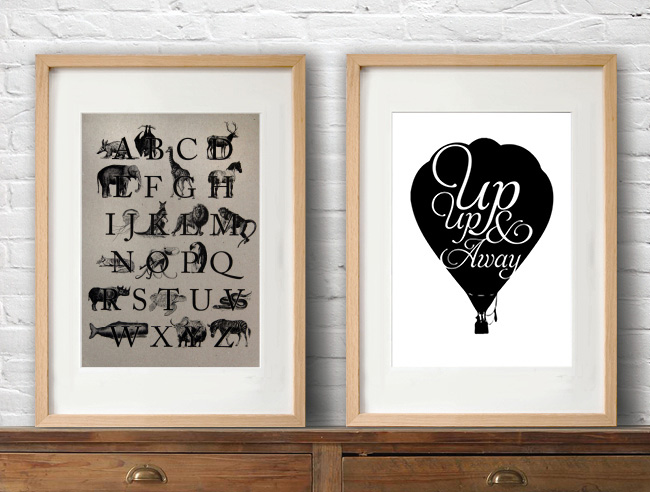
We are really excited to announce the launch of our new range of typographic prints, now available at the Boheem Shop as well as at our Etsy Store. We've framed a couple of them and have them hanging in our own homes, and they are already proving to be really popular. Some of these ideas have been bubbling away in the background in between client projects for a while now, so it's really nice that we're finally able to share them with you. We hope you like them!
Labels:
NEWS,
SHOPPING (WITH SHIPPING)
Thursday, August 16, 2012
Baggu Bags
We have been fans of Baggu reusable bags for some time, but with the relatively recent introduction of their leather range (top), we are officially wholeheartedly Baggu devotees. The simple designs are delightfully elegant, and the leather is sooooo very soft. We also love the colour options... one for each season plus a couple of extras perhaps? Bottom row is the Duck (book) Bag, the Laptop Sleeve and the Daypack. Note to self for gift ideas!
Labels:
SHOPPING (WITH SHIPPING)
Sunday, August 12, 2012
Farewell Chantel, we will miss you so very much
The studio is so quiet this morning. I'm not really sure how to start my week without seeing Chantel's cheery face and hearing all about her weekend. Friday was her last day here, after 4 1/2 years she's moving on.
What a girl, what an absolute treasure. We consider ourselves very lucky for having had her as such an integral part of the team for so long. Chantel's beautiful work is a result of a perfect combination determination, dedication and care for what she does. We will miss her so very much, and undoubtedly our clients will miss her too.
Thank you Chantel for your sincerity, for bringing your smile every morning, for the thousands of cups of tea at 9am and 3pm, for embracing whatever craziness is going on – client fun runs, blog entries, Rizzeria printing, AGDA nights, book club, gingerbread houses… we sure have had some good times.
Labels:
NEWS
Monday, August 6, 2012
Brief history of Olympic pictograms
Continuing in the same Olympic theme, I thought I'd put a bit of a study together of graphic pictograms over the years. From what I could see, the icons used in Munich in 1972 were repeated in Montreal in 1976. It's really interesting that they were bold enough to use colour for Mexico City in 1968, but kept them monotone (I added tints for fun) until Sydney broke the mould in 2000. The Mexico City illustrations are also the only ones which don't depend on human forms to tell the story.
Labels:
THOUGHTS
Subscribe to:
Posts (Atom)


